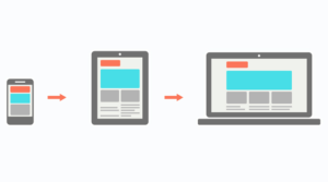
Responsive web development is when we create a site that responds instantly to the device it’s being viewed on and makes adjustments to best perform for that device. This is not just in its layout but in the way we approach design, accessibility, coding, performance, testing, and search engine optimization. Here are a few notes in regards to how we approach responsive web development.
Device Agnostic

Device agnosticism is the capacity of a computing component to work with various systems without requiring any special adaptations.
When we talk about making a product device agnostic we usually mean not making a site for any specific device or tool, but making the site work similar across several devices and different browsers with disregard for their differences.
In the past, we might have foregone specific browser features because not all browsers supported them. This caused a delay in using new web technologies. This is commonly referred to as progressive enhancement. Starting with the lowest common denominator then enhancing your way up to the newer technologies.
Another approach is called graceful degradation where we start using the latest web technologies then making sure those features “fall apart” (are disregarded behind the scenes) in a predictable and graceful fashion in older browsers. This sometimes means providing a specific feature as a polyfill to older browsers. There are techniques used to only load what is needed, preventing the newer browsers from loading in code that it does not need.
Both approaches have its pros and cons, but the end goal is creating a site that will work on as many devices and is accessible as possible. What approach we use does not mean we will use that approach for all the features on a website; it might change from feature to feature. While this is a simplified explanation of making a product device agnostic, it gives an overview of the complexities present during the development.
Mobile First
Designing for mobile first is an approach that allows for a site to be as accessible as possible. Due to the limited resources and screen size of mobile devices, odds are if your site works on a mobile device it will also work on desktop devices. If a site is already optimized to load quickly on a network limited device it will load even faster for a device with a stable network connection.
For the most part sites are now designed for mobile and worked up to larger screens, but that is not always the case. Some designers find it easier to work on the larger display and work their way down. However, from a development perspective this does not rule out a mobile-first approach.
Search Engines

Starting in July 2019, Google changed the way they index and rank websites; they now predominantly use the mobile version of the content. If you are already using the mobile-first approach, your desktop and mobile content should be almost, if not exactly, the same. This means if you are still running an obsolete, non-responsive website you will rank lower than those using mobile-friendly designs. Note: if you are using the “m” dot technique to serve the mobile version of your site, that content is what will be given priority in search results.
The above points demonstrate what responsive web development is and why it’s important to your users. At Gray Digital Group, we address these considerations on every project and take the time to think through the implications they will have for our clients.
Every handful of years it is smart to evaluate if your website needs to be rebuilt or if it needs a refresh. Technology is advancing fast, trends come and go and you don’t want to be left behind. If you are in need of a new website, contact us today!
Connect With Us Today
Sources:
Images:
https://www.creativebloq.com/advice/3-pro-tips-for-building-a-device-agnostic-ux-system
