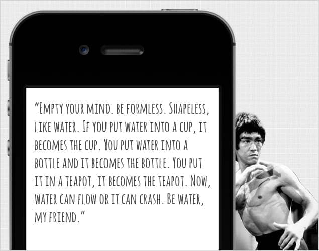
I’ve been called a web ninja enough times that it should probably be on my business card. The term probably came about during all the behind-the-scenes work that happens in web development. Coding is not a very appealing spectator-sport and the great work that goes into it is not always visually represented. In the spirit of this, I opted to share a quote below from Bruce Lee to simply explain Responsive Design.
Image credit: Michael Ochs Archives/Getty Images
What exactly IS it?
Responsive Design is a method of coding a website which allows it to structurally and visually adapt to various screen resolutions. Therefore, your site content is presented in the most optimal manner for the given viewer, improving their experience.
Why do you need it?
A chart by statista.com shows that current mobile usage is 17% globally. In America, we went up six percent in just a single year. In Asian markets, mobile usage is already over 25%.
Now consider that the latest iPhone sold a record 9 million devices as compared to the 5 million its predecessor sold. And with tech startups at an all-time high, there is going to be no slow down in mobile development in the foreseeable future to hinder further releases.
These two statistics alone should imply the urgency of which consumers are demanding mobile content.
What can we expect from it?
Ideally, a visitor will simply land on your website and it will deliver a quality experience through any device they are viewing it on and, unless they viewed the same website from an alternative device, they’d never know it was responsive. The problem with measuring consumer happiness is that most will simply not come back to your website if they have a poor experience. Responsive Design will aid in visitor retention and return visits.
How can you get started?
Many modern websites can be fine-tuned to become responsive. Older sites may require a rebuild or completely new design if their features do not lend themselves to adaptation. The best solution for a responsive website is to have it in mind from the start of a project. The development community calls this the “mobile first” approach. You start small, with the most relevant and critical content, and then build up from there. It’s a practice we are working hard to place at the core foundation of our process here.
Contact us if you’d like to further discus the benefits of Responsive Design, or if you’d like us to give your site an evaluation.

