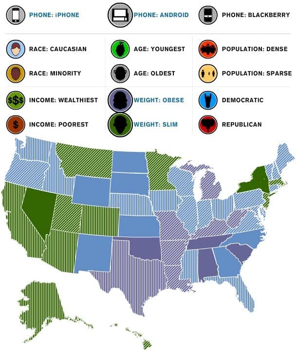
It’s Friday, and there is nothing we love more than a good infographic to give us an insight into the mind of consumers. Well, there might be one thing we love more… an interactive infographic!
TheAtlantic.com created an interactive map that allows you to see what may or may not cause the motivation for purchasing a smartphone. “iPhones sell really well in Oregon and Louisiana, not as well in Idaho and Florida. Phones loaded with Google’s Android operating system are doing great in California, but not as well in Michigan,” according to the article.
Click on the image below to play around and see which states love the iPhone, who still uses a blackberry and where the tech favorite droid resides! Have questions about how this effects your mobile strategy? Contact Us.

